
Practical Data for Nonprofits Part 5— Buckets of Reporting

Are you comparing apples to oranges by mixing up your types of reporting?
Now you know that all data comes from somewhere and has hidden costs you need to be aware of. You’ve taken a look at the stack that drives all things on all computers, and you have stared into the void and found meaning in your data. Now it’s time to bring it all together and actually get those reports you wanted when you started on this journey.
But wait — what KIND of reports?
You will be a lot less frustrated with your reporting if you understand that in the nonprofit sector, reports actually fall into four big buckets:
Operational or transactional — usually listmaking to help people get their jobs done
Managerial or performance monitoring — to help keep the day to day on track
Outcomes — the stuff you report to funders and the board
Predictive — trying to get out ahead of things by using data to look ahead, rather than looking back
And to use each of these well, it’s helpful to know that you ask different questions from different types of skillsets or software depending on what you’re asking for.
The diagram below is for Salesforce because that is Deep Why’s expertise, but you can substitute any operational system into this diagram and it will probably be accurate. If it’s on a computer, and people use it primarily to do their day to day work (or key in the results of their day to day work), it’s an operational data store and belongs in the blue part of the diagram.

A diagram showing the 3 main pieces of a Salesforce data ecosystem — Salesforce in blue, a warehouse in white, and analysis tools in yellow.
Report Bucket 1: Operational or Transactional Reports
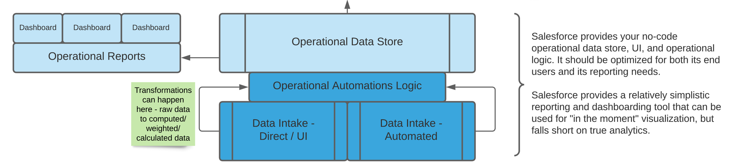
Operational or Transactional reports live in your operational data systems and are managed by the admins of that system — usually relatively expert users rather than deeply technical people, but sometimes a business analyst role who spans the gap between process and technology.
Operational (or Transactional) reports are typically “how many / how much” and “right now” type reports that show things like “how much money have we raised this year so far” or “how many participants are on each person’s case load right now.”
These belong as close to your operational data solution as possible, and typically are very well supported within these solutions. Products that support specific business processes (like accounting systems and some fundraising systems) will have pre-built reports that are designed to support real-time use of these systems; platforms like Salesforce will support someone in building those types of reports.
In the diagram above, they’re in blue. And they’re usually created and managed by end users, data managers, or business analysts.
Report Bucket 2: Managerial or Performance Monitoring Reports

An example of a Salesforce-delivered dashboard that could be used to monitor across staff for performance-related questions. This screenshot is for a sample organization with fake data.
Managerial (or performance monitoring) reports are typically KPI-style reports that grow out of operational data and help managers keep an eye on things. They are answering questions like “are we on track to raise what we’re supposed to” and “are all of my staff doing what they’re supposed to do with our participants.”
For example, if your program helps people obtain stable housing, and you know that there are typically 10–15 interactions with the housing agency required for this to occur, a managerial or performance report might:
look at how many interactions a caseworker has had on behalf of a participant, or
ask how many participants have fewer than 10 interactions after 2 months in the program.
In the diagram above, these reports may live in your operational data store (blue) or they may be incorporated into more structured data visualizations (yellow). Depending on which area they come from, they may be managed by business analysts or by a data and analysis role.
Report Bucket 3: Outcomes Reports
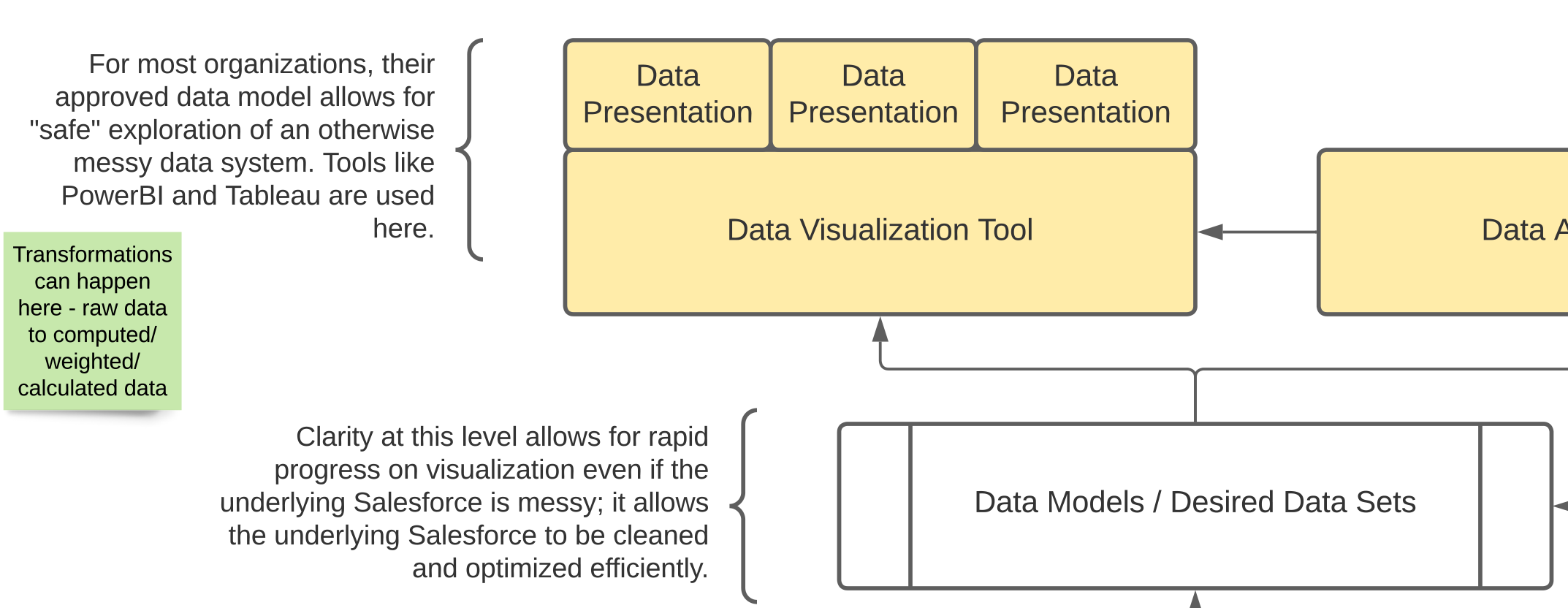
Outcomes reporting lives firmly in the analytics side of the house, usually from a data model that is fed by your operational data stores — the systems where you do your day-to-day fundraising, accounting, and program delivery work.
Outcomes are typically end of year, “look back” type reports. These are the things you report to funders and use to look across your organization’s performance year on year. They are aligned to your logic model and theory of change.
They are typically carefully defined and curated and often relatively slow to produce. They usually require a lot of processing to turn “how many/how much” data into real indicators of impact. They are often some of the oldest reports in an organization.
A change to outcomes reporting ripples throughout an entire organization and should involve many people. Most organizations’ activities are aligned around their outcomes reporting, so changing an outcome means you have to assess what front-line staff are doing, what needs to change for the new outcome to be reportable, what needs to change for training and management, and so on. It is and should be a Very Big Deal.
Outcomes reporting typically resides in the analytics (yellow) part of the diagram above and is often at least one step removed from living, transactional data.
Report Bucket 4: Predictive or Leading Indicator Reporting

Predictive reporting uses additional tools that can handle the statistical and mathematical modeling required to ask questions about which data might impact which other data.
Predictive reports are computations that run against real-time or near-real-time data to help you see if you’re on track for your outcomes or not.
An outcome might be “ensured 60% of our clients moved from unstable to stable housing in a year.” The operational data that drives the outcome might simply be a couple of fields that are “started the year in unstable housing” and “ended the year in stable housing.”
But you don’t know until the end of the year how you did, and that’s way too late. Some organizations can use their managerial reporting to keep an eye on what they might expect in outcomes. Others want to incorporate statistical analysis and, increasingly, AI to comb through every data element they capture for patterns that humans may overlook.
This work lives very firmly in the Analysis (yellow) part of the diagram and is owned by people who really understand data analysis and data modeling, statistical validity, and other mathematical pieces and parts that require a lot of infrastructure before their work can begin.
Most of the organizations I work with don’t get into predictive analysis simply due to cost and complexity, but we’re seeing it more and more and it does have an impact. Know that it is a significant investment and it comes after you already have solid transactional, managerial and outcomes reporting.
What’s with the “ETL” and “Data Model” part of this diagram?

The middle bit of the diagram, highlighting ETL, additional storage, and data models.
A data model is nothing more than the way the data fits together so that it can be analyzed correctly. Your transactional data store might have the data spread across many different objects (tables) — think about it like lots of different tabs in a spreadsheet.
When you want to analyze it, you need to understand how all those pieces fit together. Sometimes you need to change it from one format to another — to “flatten” it (for example) so that you have one row per person with many columns representing activities. That has to be done with programming or in a query language like SQL. Data visualization tools also have a range of ways to construct a data model that can be used for dashboards and reports.
The data as presented in a structure optimized for your visualizations is a data set. This might be the one spreadsheet tab that you’ve created by combining all the others so that you can pivot it how you want. Or it might be a database table or view or any number of other things.
ETL means “Extract / Transform / Load.” Whenever you have to move data around between systems, you’re doing a type of ETL. Even downloading a csv (“extract”) and manipulating it in Excel (“transform”) can fit this pattern.
“Possible Additional Storage” — sometimes you don’t need anything other than your operational data store, but sometimes there’s value in having several different sources of data pooled together into a single, separate system (like a data warehouse).
So what?
As you ask more complex questions of your data, you may run into some of these terms so it’s helpful to know what they mean. You will run into a range of roles or job descriptions and ways to approach reporting and analytics, and having a handle on some of the key concepts can make your reporting asks a lot easier.
There are a range of different labels applied to the things covered in this article. The key for data literacy in nonprofits is knowing that data is produced and meant to be consumed differently, for different purposes, and that different skills may be required to answer your reporting questions depending on which category they fall into.
Congrats! You made it!
I hope you’ve learned a lot about data in nonprofit organizations. Maybe you’ve picked up some new ideas about the kinds of questions you can ask from the systems you’ve got, or learned a bit about why it can be so difficult to adapt a database to your ever-changing organizational needs. Maybe you’ve gained a new appreciation for why your data team can be so annoying when you ask a simple question.
You made it this far, and we really appreciate you reading. Happy nerding out!
This article is part of a series on data literacy for nonprofit leaders. Its goal is to share terms and concepts that aid in making good technology decisions when you’re not a technology expert (or even if you’re a little bit tech-phobic).
See the overview here